
BLUE: A PILLAR OF STABILITY IN INTERIOR DESIGN
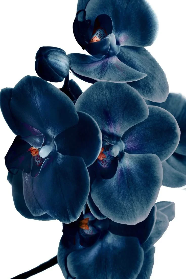
At Studio Thomas, the colour theory of blue goes beyond visuals, it's an emotional pillar we intentionally incorporate into our designs. Symbolic of stability, a core value at Studio Thomas, it’s a colour you can trust without thinking. You see it in the uniforms of airline pilots and first responders. You find it all around us in nature, in the ocean and the open sky. It’s a quiet, yet impactful colour choice that evokes confidence, calmness, and emotional grounding without needing overpower. It’s a classic. Like your favorite pair of jeans, it never demands attention, but it always earns it. As we reflect on this quarter’s theme of less, but better, blue remains at the forefront of our design philosophy.
As a primary colour, blue holds an essential place within colour theory. Its range of hues is especially interesting, as each shade evokes a different emotion. Lighter blues communicate serenity and openness, while deeper blues convey depth and professionalism. In interior design, blue creates emotional stability, its grounding, but not overwhelming. In fact, in recent years, we are seeing blue take on the role of neutrality within design. As Kristen Thomas puts it,

“Blue is turning into more of a neutral, and I really like that.”
Its natural adaptability has allowed it to transition into a foundational neutral tone. It can be seen across design styles: traditional homes, coastal homes, modern renovations, and European-inspired interiors. Its innate flexibility makes it timeless.
Kristen’s love for blue began in design school, sparked by a friend’s passion for the colour. This influence allowed Kristen to see blue in a new light. It opened her eyes to the emotional potential of colour and the value of seeing through someone else’s perspective. Kristen shares,
“Every colour is beautiful, it just depends on how and where it’s used.”
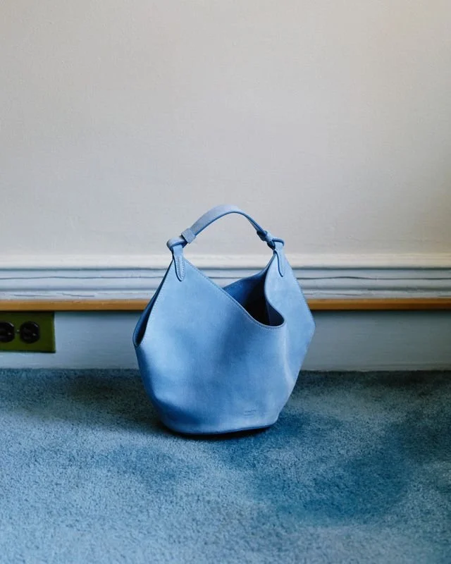
Today, blue appears in many Studio Thomas projects. In No. 011, layers of blue are found throughout the home, from various textiles to tiles, each tone was selected and placed with intention. In No. 022’s kitchen features a gorgeous oven whose colour is a blend of navy and black (“blavy,” as Kristen refers to it) creating a grounding palette that still feels soft and refined. Whether it’s in a backsplash, a painted vanity, or on the walls, blue has become one of our favorite colours to bring a sense of peace and depth into an environment.


If there’s one color that reflects the Studio Thomas philosophy of less, but better, it’s blue. It’s timeless. Classic. Versatile. It invites calm and connection. As Kristen puts it,
“It’s the color of anything principal oriented—it shows stability.”
And in a world that often moves quickly, blue gives us space to slow down and breathe. If you feel ready to bring more stability into your home, contact a Denver interior designer at Studio Thomas, and let’s start with blue—together.